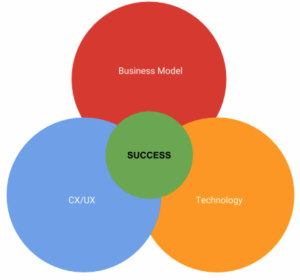
There’s a fire in the building and you can only save two out of these three things: User experience/customer experience, business model innovation, or the technology-driven product/service underlying your whole raison d’etre.
Which do you save?
(Note: This is a trick question).
Do you…
- Keep the “good” business model and powerful tech but throw away CX/UX?
- Harness an effective business model and prioritize UX/CX but forego tech?
- Juggle UX/CX in tandem with tech but let the business model go?
If you guessed Secret Option Number 4, “All three,” you’d be right.
You might be wondering:
How the heck are we supposed to balance all three?
Luckily, there’s an intrinsic relationship between the right business model, the actual tech product and the UX/CX design component that encourages and supports users in their adoption.
An alignment of all three is a continuous but seamless process — if you’re making all three an equal priority.

Lose a grip on just one and you might experience the following:
- Good business model and innovative tech/app product, but bad CX/UX? That means a lower number of users with no competitive edge.
- Good business model and effective CX/UX, with poor underlying technology? The result is low efficiency with an unsustainable operation (ex. outdated or slow-progressing, cross-platform solutions).
- Streamlined UX/CX and powerful technology, with a misaligned business model? You’ll miss out on a tangible value prop, a tech demo without any real value or purpose for customers. This means, once the novelty has worn off and the honeymoon period is over, user acquisition will decline and the company won’t be making any money
Business success comes from a masterfully planned business model built on and responsive to real, flesh-and-blood, felt and experienced problems of your customers.
Yes, you want to look for these problems — and then you want to respond to these problems with your web app product or solution. Your value proposition articulates this to your customers while the technology and overall CX/UX subtly convinces and converts them as committed users.
So how do you balance all three? It’s not exactly “simple” but it doesn’t have to be complicated either. Often, digitization is the first step to transformation.
Let’s take a look at three specific steps that will grow these transformative activities.
1) Start With a Solid Value Prop and Business Model
If you don’t have a value prop, you don’t have a product. But if you don’t have a value prop, you can’t make a promise to your users.
Your app’s value prop is the first and only thing that determines when your users will even find a use for what you’re selling — or if they’ll end up hitting the BACK button. That’s the customer-facing side. For you, articulating and outlining the value prop is an ongoing endeavor because this will be the main thing you’re going to test.
This promise is not a static, set-it-and-forget-it statement either — your value prop needs validation on the market, via customer/user interviews and surveys, as well as measuring through user tests.

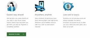
Source: Uber
Uber’s value prop is a two-fold message and functionality. It clearly conveys to the two key pockets of users — passengers and drivers — what they stand to gain and, implicitly, how they can expect the app to work, based on this promise.
From apassenger’s point of view, Uber delivers on the following:
- No need to wait for a taxi for long times
- Free rides on certain occasions and discounts from time to time
- Prices lesser than the normal taxi fares
- Uber’s tagline says — “Your personal driver”, promising customers that they can not only travel in style but also on their own time
- Fixed prices for common places like the airport, etc.
From the driver point of view, they stand to gain from:
- An additional source of income
- Flexible working hours: Can work part-time, according to their own schedules
- Easy (and dependable) payment procedure
- Those who love to drive can earn money while pursuing their hobby
- Uber pays drivers to be online, even if they don’t get any requests (i.e. “guaranteed”/base income)
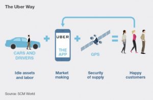
And, then, Uber app developers and designers deliver on this promise through an app that functions at scale. Being able to create profit at scale is what helps determine the cost structures, margins, and even processes that will be required moving forward.

Source: SCM World
In the case of Uber, identifying and then clearly articulating its two main user/customer bases and their promise to each through one app helps them make decisions on:
- Key resources or assets that will be required to deliver on this value prop (people, tech, channels, etc.)
- Key processes,which are the operational and managerial requirements needed to deliver this value in a consistent and scalable way (UX/CX, testing, development, iteration, sales, marketing, etc.)
2) Constantly Test and Refine Your CX/UX
Your value prop is connected to your business model, which, in turn, gives you partial answers for some key business decisions.
But what about decision-making when it comes to the production and development of your app?
The second step focuses on the app’s process and will call on you to put yourself in your users’ shoes. Good thing you’ve already figured out who your main customers are, right?
To determine how easy, enjoyable and effective your built app is for your customers, you’ll need to define a clear and logical sequence of events that take your customer from “problem-aware” ( in this case, I need to find a ride and fast!”) to solution-use (“I have a ride-sharing app that I can access to cure this need!”)
UX/CX is not just a novelty or all about fancy screen transitions.
It’s a measurement of how useful or effective your app or solution truly is in guiding the user toward their end goal. The question is if they’ll arrive at that goal easily or if the journey will be confusing, infuriating, counter-intuitive, clunky, or just plain frustrating?
The good news, as you can see, is that while there are many ways to go wrong, there is only one way to make it right. And that’s to constantly test and refine your app’s features, processes, and offerings, based on real users interacting with and using the app.
Once you’ve gathered actionable data from user tests, customer surveys and interviews, you’ll need to translate this data into design and development imperatives ready to be prototyped.
During the prototyping process, you’re going to be testing different layouts, solutions, and flows that respond to these customer use data points.

Source: Uber Design on Medium
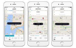
In the case of Uber, there are clearly themed screens that align with the goal for each step in the process:
- Requesting a cab for an address
- Searching and matching the passenger with a driver
- The arrival of the driver and the distance from the passenger
- Ride in progress…
- Payment & rating at the end of the ride

Source: Uber Design on Medium
All of these are combined with a fleshed out, well-refined UI/UX, which eliminates a lot of friction points in user acquisition and retention.
3) Build a Powerful Base Product Using Innovative Tech as Both a Resource and a Driver
Okay, so you’ve got your profit formula, which is your value prop and aligned business model.
Then, as a second step, you have the key processes, which are your customer and user experience design, iterations, and tests.
Now, what about your key resource?
The underlying tech you use is the key resource or asset you’ll employ to drive digitization and successful digital growth forward. So, the technology should be both innovative and sophisticated.

Source: Uber Engineering
Uber’s engineering and development department, for example, had a very clear and succinct, actionable mission:
“Uber’s mission is transportation as reliable as running water, everywhere, for everyone. To make that possible, we create and work with complex data. Then we bundle it up neatly as a platform that enables drivers to get business and riders to get around.”
— Uber Tech Stack, Part One
Technology gives you an edge over the competition because it’s the tracks on which customer experience (UX/CX) runs its train.
It’s the initially (seemingly) expensive investment that brings you long-term ROI because of how much hassle it saves and how successfully it onboards and retains your customers right from their first interaction.
And you must deliberately craft a tech stack that responds to and serves this goal of digital growth. Uber’s engineering team certainly understands the power of this:

Source: Uber Engineering on YouTube
As an app development company, we’ve seen that solid, native development right at the beginning is a business’s vote of confidence in its own long-term viability.
Plan to be around for decades to come? Then plan for growth. Plan for a huge amount of users. This doesn’t mean getting extremely fancy or implementing resource-sucking features your user doesn’t need.
By all means, keep it simple. But prioritize these “simple” tasks by allowing your app’s development to perform them consistently, reliably, and excellently.
The added bonus? When you do inevitably reach the envisioned number of users, you won’t have to rewrite the whole solution to handle a larger load. You’ll be ready for it.
“Uber’s maps teams prioritize the datasets, algorithms, and tooling around map data, display, routing, and systems for collecting and recommending addresses and locations.”
— Uber Tech Stack, Part One

Source: Uber Engineering
The Venn diagram we saw before, between internal and external impact, affects many interconnected decisions. As you can see, something such as maps, on the backend, requires the use of a powerful and aligned tech stack which is able to handle the task’s requirements.
In this case, the Uber Engineering team chose a primarily Java-based stack.
And don’t take for granted the fact that backend and user-facing activities need to align. What looks to developers and designers as data in the backend:

Source: Uber Engineering
…can (and should!), to users, easily translate into an experience like this:

Source: Uber Design on Medium
Conclusion
It’s time to look at growth in an entirely different way. Instead of a set of disconnected practices, the keys to digital growth are ongoing in nature. Because of increasing integration and interconnection, decisions in one aspect — the business model, for example — necessarily affect the level of technology innovations demanded or the development style used.
The “bad” news: You can’t prioritize one over the other and expect to reach either business success or experience digital growth.
The good news: Any gains you make in one will naturally spread to and affect the others.


