


In 2009, Google was hot on the need for a new kind of project management with collaboration at its heart.
But the design was not so hot.
Let’s say that this was the first wave of its attempt to improve collaboration across teams. The result not only bombed, it totally languished.
This is what the first iteration looked like.
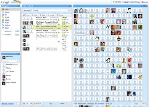
Never mind the dated design; the problem was that Google failed to “Keep It Simple Stupid.” The platform was much too busy and felt complex — too complex for an individual to even want to try and navigate.
This unnecessary complexity popped up again in the fact that Google was focusing on too many projects at once. It decided to launch Google Buzz before Google Wave was fully integrated.
Coupled with its limited user adoption strategy, the project gained zero traction and was an unmitigated disaster.
Live and learn, right?
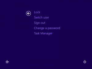
Three years later, the Windows 8 debacle proved to mobile development companies the power and importance of continuity and consistency.
One of the prime principles of UI/UX design is to keep a user’s expectations alive. What a user expects, a user should receive — not least because, through your previous iterations, you’ve likely spent time and money educating your users about how your interface works.
When Microsoft first released Windows 8, it was a clear shot at Apple who was quickly eating up market share.
First big mistake: Trying to ape another platform’s functionality.
From here, things got worse. Because Microsoft abandoned their initial interfaces entirely, users were completely unable to find the most basic functions.
Navigation was a nightmare and these major changes came at the expense of their users’ expectations.
Anyone using a Windows PC knows that the desktop and the Start menu are the main points from which to operate tasks and access the file system.
Instead, Windows 8 users were subjected to an OS that was trying to fulfill the duty of two: It was intended to be both click and touch-friendly
The problem was that, in trying to accomplish both, it did neither well.
First, Windows 8 removed the Start menu and the default Desktop screen, completely pulling the rug out from under users who, over years of loyal and expected use, now had ingrained expectations.
After the ensuing chaos and uproar, the customer experience was completely diluted. Sure, Microsoft re-introduced the Start button in version 8.1 — but not before many chose to downgrade to Windows 7.
Now, does this mean that interfaces shouldn’t evolve or that visual identity shouldn’t keep up with modern design standards? No. Certainly not.
But that’s why changes in UI/UX design need to…
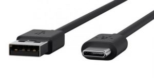
It’s not scientifically proven or anything but, about 50% of the time, USBs are inserted incorrectly. The user sighs, frustrated, then pops it in again, fingers crossed, hoping and praying to the powers that be that this time, it’ll actually stay in.
We all know how this story ends.
The USB is a very common tool and we still rely on USB connected devices every single day.
To this day, we’re never quite sure whether we’ve inserted it right.
This serious design flaw has a pretty simple fix. To understand it, just look to its predecessor: the plug. Sockets and outlets have their own configurations that are visible to the user, neatly indicating how plugs should be inserted.
Or you could completely eliminate the USB connector once and for all and opt for a design that doesn’t depend on the orientation of the plug.
Apparently, designers for Apple and Android phones agree: the latter introduced the lightning connector, while Android phones have developed the C-type USB.
Source: Dignited
UI/UX’s power is the fact that anything, given enough time and thought, is ultimately changeable.
Sometimes, all it takes is for UX designers to put themselves in their users’ shoes and look at it from their perspective. It’s why the stages of design — such as prototyping or running sprints — is so crucial to the process of good design.
Avoiding pitfalls is a collaborative process and it calls for iteration. This iteration shouldn’t be avoided. But there is definitely a way to do prototyping right — prototyping for pros.
Learn more about how to rapidly prototype for software development and bring a sense of business value to your design team.