Personalization and Targeted Marketing Through AI-Driven UX

p-img2
Picture of Attrecto team

Attrecto team

Personalization and Targeted Marketing Through AI-Driven UX

Imagine a world where you can anticipate every one of your customers’ intentions the moment they interact with your business. Now, imagine being able to tailor every interaction to each customer’s preferences, personalizing the user experience down to the last details, from colors and themes, through to product placement, recommendations, and serving the most suitable content and features. Think about just how easy it would be to steer the actions of the customers in your favor using marketing strategies based on a personalized UX model.

The prospect is tantalizing and seemingly magical. But these are just some of the things that AI-powered UX is capable of realizing.

AI is one of the fastest-growing tech innovations in the modern digital landscape. Its global market size is expected to reach just over $35 billion by 2025, at a staggering 57.2% CAGR. The fact is, more and more organizations now appreciate the value of AI-driven UX and are integrating AI-powered tools to their UI/UX design and marketing strategies.

Download your free guide for development process in UX driven projects 


AI-Driven UX Goes Beyond Automation

AI plays a significant role in automating business processes and workflow operations. However, there is much more to that story when it comes to an AI-powered user experience.

One of the conventional approaches to testing usability and user satisfaction on E-commerce platforms has always been A/B testing. A/B tests or split tests involve creating two or more versions of the same web page and showing each version to different groups of visitors. The versions are then critically analyzed and compared to find which design model gives the optimal results.

The problem with such an approach is that it gives you a very static user experience model. In other words, you are only meeting the majority of customers’ demands without considering individual preferences and anticipating behavioral changes. There is nothing to reflect that each customer and visit is unique.

Automated UX solves these problems by creating a dynamic user experience that actively adjusts to the needs of each customer. The AI-driven design of ntelligent UX “knows” what products and services to recommend, which content to show, which emails to send, and even the greeting message to show each visitor or customer. Personalization is a critical factor in the success of modern marketing techniques; in fact, 90% of leading marketers agree that personalization contributes profoundly to profitability.

Automated Analytics Through Intelligent UX

Besides personalization, intelligent UX also provides the business with powerful insights into the market dynamics and the brand’s performance. You’re probably already familiar with the concept of Big Data and robust analytics systems. These systems entail collecting and thoroughly analyzing vast volumes of data to draw meaningful conclusions from data patterns.

Data collected from customer interactions can be integrated into automated KPIs – for example, an experienced user who is more familiar with the application might use a complex user interface. In contrast, a less-experienced user will require a simple and intuitive interface to allow him to learn how to use the application without frustration.

Intelligent UX provides a greater scope of data from a multitude of unique customer engagement scenarios. Marketing automation involves three crucial strategies – generating qualified leads, converting those leads, and extending the lifetime value of the customers. There are four significant indicators to consider when automating your marketing process:

  •  Acquisition indicators
  •  Engagement indicators
  •  Conversion indicators
  •  Retention indicators

Automated KPIs rate leads generation, their conversion rates, and the value of qualified leads through intelligent scoring metrics. The most attractive benefit of using AI-powered marketing tools is making predictive analysis. You can leverage the power of AI-driven UX and data analytics to adjusts your business model and marketing efforts based on precise predictions of consumer behavior and market trends. A case in point is a chatbox experience, where the use of AI-driven UX would allow us to anticipate erroneous or unwarranted responses to ensure a smoother user experience.

Anticipating customer frustration or pain points can be the difference between retaining a customer and losing one completely. You can harness AI to identify when certain user behaviors would indicate that a customer is about to drop off, and surface proactive messaging that can cue the user with customer service support.

AI analytics may soon replace the conventional KPI dashboards. Smart analytics provide the businesses with so much more besides basic information. It’s about creating insights that companies can act on in real-time. AI companies such as AmpleroGumgum, and many others are already offering marketers with state of the art AI-powered marketing insights and metrics. Such companies provide advertisers with more effective ways of reaching their target audiences and judging their marketing performance through intelligent personalization.

What The Future Holds

Just about every software developer, especially in the E-commerce field, is keen on implementing AI features to improve product usability and UX. And this is not restricted to webpages either, as AI-driven UX is also growing popular in mobile development, particularly in mobile services and apps. Considering that more than half of all internet users access the web via smartphones, focusing on mobile users makes a lot of sense.

Combined with other similar technologies like augmented reality, machine learning, and deep learning, AI algorithms are growing more sophisticated and powerful, leading to faster, more accurate, and more useful, AI-based tools. Web pages, apps, and digital enterprise resources can now identify and support human needs (at least to some degree), which is the core purpose of AI-driven UX.

It’s safe to say that you should expect a lot more from AI-powered UX in the coming years. Intelligent UX will continue to reduce the cognitive load on consumers and ease E-commerce marking efforts.

Download your free guide for development process in UX driven projects

Share this post

Business Requirements in Software Development

Picture of Attrecto team

Attrecto team

Business Requirements in Software Development

When a client contacts a developer about a software development project, they either have a very clear idea of exactly what they want or just a vague idea of what they want to achieve.

Either way, it’s vital to define the scope of the project before starting work so both parties understand the deliverables and timescales at each stage of the project.

At Attrecto, we’ve developed a short template for clients to fill out when they first contact us about a project. This helps to guide the client through the decision-making process and answers some important business-related questions before we even start thinking about software solutions.

Download your free guide for development process in UX driven projects 


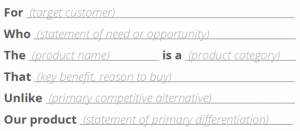
Creating a Value Statement

Many clients aren’t concerned with the specific features and functionality of software at this stage. It’s more important for them to nail down the business requirements that should be based on their vision or goals for the project.

source: scrum.org

One value statement may not cover the needs to be addressed and the business solution for every customer the client wants to serve. If this is the case, they should develop a value statement to target each group of customers. The final set of value statements will describe the functionality and business solution that are required to meet the needs of all users.


Developing the Value Statement into a Business Outcome Hypothesis

The value statement should capture the major goals and functional requirements of the project, but we then go into more detail by using it to create a business outcome hypothesis. This hypothesis has several important functions:

  • It states the quantitative and qualitative benefits that the business can expect if the hypothesis is proven to be correct. These benefits may be in terms of users affected, the expected impact on processes, products, services and costs, sales, revenues, etc.
  • It defines leading indicators that can be used to help predict the eventual business outcomes. Some examples of leading indicators include the number of users, subscriptions, costs per user, etc.
  • It determines nonfunctional requirements, which are features of the software solution not related to its functionality, such as which architecture and infrastructure it uses, how the software is built and updated, network usage and bandwidth, performance, availability, security, backup, stability, capacity, regulatory details, usability, interoperability, costs, configuration, documentation etc.

If you’re new to the idea of using hypotheses in software development, the concept is not so different from the hypotheses you were probably asked to develop as part of high school science class. You’d then carry out an experiment to test this hypothesis.

You can think of a hypothesis as a “prediction” or “best guess” of what the project will achieve.

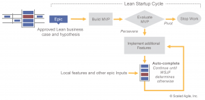
An example of a basic hypothesis for software development might be something like: “We believe we can reduce our support requests by implementing a chatbot that will instantly answer frequently asked questions. We’ll know this is true when the number of support requests is reduced by X amount.

We then test this hypothesis in the leanest and quickest way possible to find out early in the development process if the solution currently in development is fit for purpose.

source: scaledagileframework.com

By using this method to define the scope of the project, we avoid adding unnecessary features or focusing on the features themselves rather than the business outcomes.

Other Information Needed Before Development Starts

Developing a business outcome hypothesis is a key concept in agile software development, and it helps us to make sure we’ve defined the full scope of the project before any work starts.

In addition to this formal process, we also capture and discuss other business-related information with the client that may be necessary or helpful for planning development. This may include:

  • A detailed description of business process steps
  • Definition of user stories and use cases in general
  • User personas (with roles in the system)
  • Minimal viable product features (the must-have features of the final solution)
  • Additional potential features (the nice-to-have features of the final solution)
  • Major milestones and deadlines.

By establishing the groundwork and expected business outcomes of your software development project in the beginning, you won’t just have a more seamless experience. This is how you’ll get the results you want to see. 

Download your free guide for development process in UX driven projects
Share this post

Why creating valid user personas is Vital in Software Development

Picture of Attrecto team

Attrecto team

Why creating valid user personas is Vital in Software Development

You’ve probably had some experience of user-testing or launching software that’s failed spectacularly. What may seem like an intuitive UX and useful functionality to you could fall apart in seconds when an actual user sees and uses your software for the first time.

But how can you anticipate how your users will think about and use your software before you reach the prototyping and testing phase?

User personas are the answer. By keeping the focus on the user experience during the design process, you ensure that every member of the development team is on the same page and working towards the same goals.

Download your free guide for development process in UX driven projects 


What is a User Persona?

User personas are an integral part of agile development and user-centered design. They enable the development team to think about the needs of the actual end users of their product rather than focusing on a set of features without considering if they’re actually wanted and needed.

Creating user personas for your app development company puts a human face on your users, making it easier to create software that suits their needs. Rather than trying to think about how to design for your users as a generic group, you can think about how you can make your app easier for “Bob” to use, or what features will be useful for “Sarah”.

source: Dribble.com


How Creating User Stories Helps the Software Design Process

Your user stories build on your user personas to describe what each user wants from the product so it fulfills their needs.

These user requirements become a list of features that form the basics of your app design and development. Each user story is a short sentence focusing on one aspect of functionality and usually has a “who + what + why” structure. For example: “Anna wants to organize her time so she can be more productive”.

source: Knowledge TRAIN


How to Create User Personas and Stories

As a mobile- and web app development company, we just cannot emphasize this enough: Start by researching your market – the end users who will actually be using your software or app. If there’s an app with similar functionality already out there, look at who is using it and what they’re saying in feedback on app stores.

If you’re developing something completely new, interviews with real people are the best way to gather this kind of intelligence. Concentrate on their needs and challenges rather than your proposed solution. If you work for a web development company, information from analytics and social media is useful too.

This research will give you a good basis for creating user personas based on real people. Some information you might want to include in your personas include:

      • Name

      • Background (career, educational experience, interests etc.)

      • Job title and responsibilities

      • Knowledge level (about the concept of the app)

      • Context (what are they using the app for?)

      • Environment (where are they using it? E.g. at work or at home)

      • Pain points and challenges

      • Goals and Motivations (what do they want to achieve by using the app?)

Based on our decade of experience with mobile apps, three to five personas are sufficient for most apps and software projects. Once your team is familiar with the personas, you can create user stories based on your earlier research.


The Risks of Not Using Personas

Skipping the important step of creating user personas and stories is a huge risk. Without a clear picture in your mind of who you’re designing and developing for, there is a significant chance you’ll end up creating something that’s not suitable for your users.

Even worse, you could create an app that might work well for you but doesn’t really meet the needs of anyone else.

Using personas and user stories helps to position your product better in the marketplace and ensures you’re creating software that your audience wants and needs.

Download your free guide for development process in UX driven projects
Share this post

Biggest UX flops in tech

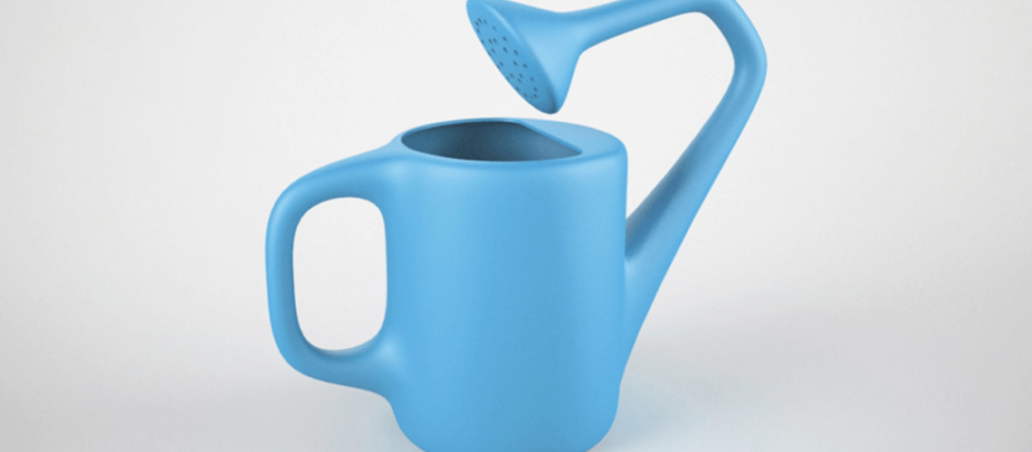
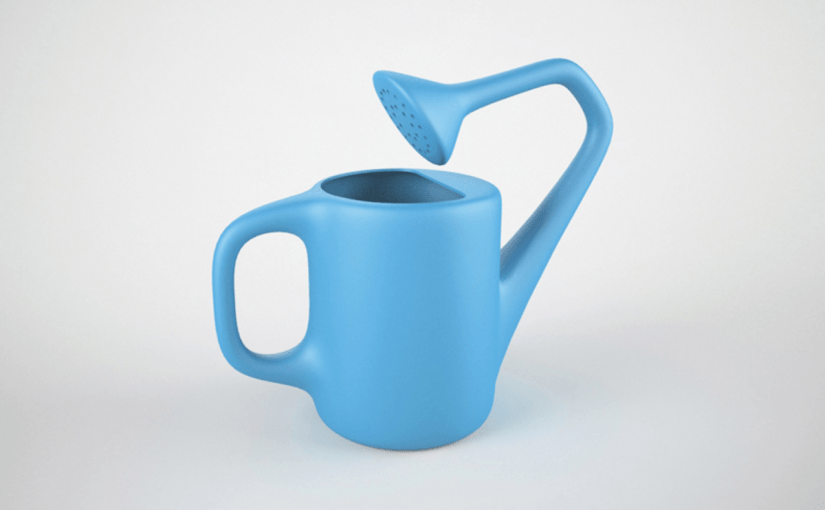
15-useless-product-designs11
Picture of Attrecto team

Attrecto team

Biggest UX flops in tech

The Biggest UX Fails in Tech History 

Even great teams fail. 

Even strong brands miss the mark. 

When a UX design goes wrong, everyone loses: the brand, the business, your reputation, your revenues, and, most of all, your users. 

You know, the people keeping the lights on?

In 2018, Icons8 lost 47% of their users thanks to a badly informed UI/UX design.

Walmart lost $1.85 million because of a failure to examine user experience surveys. This data is central to validating the central hypothesis of a UX design. 

And it’s not confined to companies — in 2011, the UK government was forced to scrap a £12 billion project for a patient records management system because of repeated issues. The web development company and teams consistently failed to meet targets on usage, functionality, and benefits. 

The Health Secretary Andrew Lansley had this to say about the failure: 

“The program let down the National Health Service (NHS) and wasted taxpayers’ money by imposing a top-down IT system on the local NHS, which didn’t fit their needs.”

UX fails come in all shapes and sizes because UX is not just about how it looks. UX is just as much about how it works. And it’s about the actual process behind the design. 

As you’ll see from these major fails (and one truly frustrating flaw that we still encounter today), it’s not just that the timing wasn’t right — the entire process matters, from the details of when to launch and how to meet customer expectations, to whether users have actually tested the prototype.team.

Download your free guide for development process in UX driven projects 
Google Wave (2009)

In 2009, Google was hot on the need for a new kind of project management with collaboration at its heart. 

But the design was not so hot.

Let’s say that this was the first wave of its attempt to improve collaboration across teams. The result not only bombed, it totally languished. 

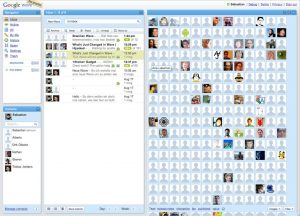
This is what the first iteration looked like. 

Never mind the dated design; the problem was that Google failed to “Keep It Simple Stupid.” The platform was much too busy and felt complex — too complex for an individual to even want to try and navigate. 

This unnecessary complexity popped up again in the fact that Google was focusing on too many projects at once. It decided to launch Google Buzz before Google Wave was fully integrated. 

Coupled with its limited user adoption strategy, the project gained zero traction and was an unmitigated disaster. 

Live and learn, right?

Windows 8 (2012)

Three years later, the Windows 8 debacle proved to mobile development companies the power and importance of continuity and consistency. 

One of the prime principles of UI/UX design is to keep a user’s expectations alive. What a user expects, a user should receive — not least because, through your previous iterations, you’ve likely spent time and money educating your users about how your interface works. 

When Microsoft first released Windows 8, it was a clear shot at Apple who was quickly eating up market share. 

First big mistake: Trying to ape another platform’s functionality. 

From here, things got worse. Because Microsoft abandoned their initial interfaces entirely, users were completely unable to find the most basic functions. 

Navigation was a nightmare and these major changes came at the expense of their users’ expectations. 

Anyone using a Windows PC knows that the desktop and the Start menu are the main points from which to operate tasks and access the file system. 

Instead, Windows 8 users were subjected to an OS that was trying to fulfill the duty of two: It was intended to be both click and touch-friendly

The problem was that, in trying to accomplish both, it did neither well. 

First, Windows 8 removed the Start menu and the default Desktop screen, completely pulling the rug out from under users who, over years of loyal and expected use, now had ingrained expectations. 

After the ensuing chaos and uproar, the customer experience was completely diluted. Sure, Microsoft re-introduced the Start button in version 8.1 — but not before many chose to downgrade to Windows 7.

Now, does this mean that interfaces shouldn’t evolve or that visual identity shouldn’t keep up with modern design standards? No. Certainly not. 

But that’s why changes in UI/UX design need to…

  • Be incremental
  • Keep the main functionality alive, even if the look and feel changes
  • Be based on the results of tangible user testing 

The USB

It’s not scientifically proven or anything but, about 50% of the time, USBs are inserted incorrectly. The user sighs, frustrated, then pops it in again, fingers crossed, hoping and praying to the powers that be that this time, it’ll actually stay in. 

We all know how this story ends. 

The USB is a very common tool and we still rely on USB connected devices every single day. 

To this day, we’re never quite sure whether we’ve inserted it right.

This serious design flaw has a pretty simple fix. To understand it, just look to its predecessor: the plug. Sockets and outlets have their own configurations that are visible to the user, neatly indicating how plugs should be inserted. 

Or you could completely eliminate the USB connector once and for all and opt for a design that doesn’t depend on the orientation of the plug. 

Apparently, designers for Apple and Android phones agree: the latter introduced the lightning connector, while Android phones have developed the C-type USB. 

Source: Dignited

Conclusion

UI/UX’s power is the fact that anything, given enough time and thought, is ultimately changeable. 

Sometimes, all it takes is for UX designers to put themselves in their users’ shoes and look at it from their perspective. It’s why the stages of design — such as prototyping or running sprints — is so crucial to the process of good design. 

Avoiding pitfalls is a collaborative process and it calls for iteration. This iteration shouldn’t be avoided. But there is definitely a way to do prototyping right — prototyping for pros. 

Learn more about how to rapidly prototype for software development and bring a sense of business value to your design team.

Download your free guide for development process in UX driven projects

Share this post

Business Value of Design

wallpaper
Picture of Attrecto team

Attrecto team

Business Value of Design

Boosting Your Business Value With the Power of Seamless Design

Companies with a greater emphasis on design seem to win out in every sphere. From revenue to customer satisfaction, greater levels of growth and more predictable long-term sustainability, the power of seamless design is doing more to boost business value right now than any other singular investment. 

It may have something to do with the fact that better design starts with a customer-centric approach and culture. An alignment, in other words, with internal and external priorities. And while numbers don’t necessarily give the whole picture, like scaffolding, they help support decision-makers as they take a closer view into the details of the structure. 

Certainly, that’s what McKinsey’s groundbreaking study on design for better business value shows both shareholders and company executives, allowing us to examine:

  • Why companies with design-led experiences are on the up-and-up in every way
  • What the elements are that are absolutely integral to bringing business value
  • The specific, actionable principles each company can incorporate to experience the promised land of growth-revenue-brand-longevity through something like design that, when it’s working well, is supposed to quietly move into the background 

Let’s take a look.


Convergence is Upon Us


Two minutes into a conversation at a networking event, a UX designer who’s asked what his work actually consists of struggles to come up with just one neat little phrase that might cover the breadth of value that design brings to the company’s business. 

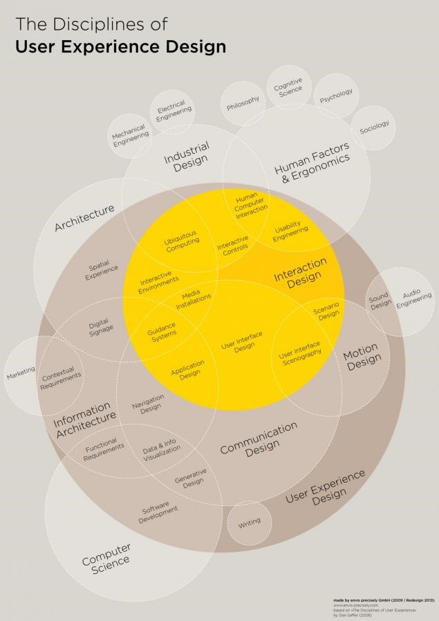
If he were doing an AMA session at a conference, he might stay silent and simply pull up this oversized Venn diagram to try and succinctly respond to the question:

Design Disciplines creating business value

Source: Visual.ly

Research by McKinsey reveals a very clear reasoning for incorporating, enhancing and focusing on the way in which design is actually the purveyor of professionalism, productivity, and profits. 

Of 100,000 design actions surveyed from the design practices of 300 publicly listed companies within a five-year period, Mckinsey found that good design equals “superior business performance.”

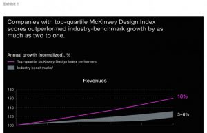
Known as the “McKinsey Design Index,” top performers were those that showed the greatest improved financial performance, in accordance with four broad design principles. Companies with top-quartile MDI scores outperformed the standard industry benchmark “by as much as two to one.” 

Design focused companies generating more revenue

Source: McKinsey Design Index  

To understand why design is so integral, let’s go back to that Venn diagram. The most obvious takeaway is that the lines are blurred between disciplines, and each intersects and converges — to a greater degree than ever before. 

The reason that companies with specific design practices perform significantly better than their competitors is because:

  • Excellent user interfaces and customer experiences are a standard expectation (with tangible benefits like increased user retention, more targeted marketing budgets, greater levels of profitability due to customer satisfaction and brand loyalty, etc.)
  • There is a major level of convergence going on, not only in the operational “backend” of companies but in the physical and digital worlds (think omnichannel shopping experiences and QR codes), along with a blurring of lines between products and services (think Microsoft’s branch into cloud services, under Satya Nadella, responsible for the greatest profits in Q4 of 2017)


Elements of the Design Process Integral to Outstanding Business Results


The design process, in the context of direct financial performance and revenue generation, comes down to four broad but essential components. 

  • Analytical leadership: Being able to implement the software, tools, and technology that measure the drivers of design performance with the same rigor, focus and deliberation as revenues and costs
  • Cross-functional talent: Nurturing teams of designers and developers that work together, along with the structures — like running sprints — that make user-centric design part and parcel of everyone’s focus or job, rather than being siloed to one department
  • Continuous iteration:Making the development process a risk-reduced process by continually listening, testing, and iterating with end-users
  • User experience: Bringing together the disciplines and measurements of physical, digital and service design, especially breaking down the internal or operational walls

We’ve already seen “data-driven” decisions. But what about “design-led decisions” in improving business value? 

This matters now more than ever because of the opportunity that businesses have to tackle their processes from a standpoint of cost-efficiencies, rather than cost-cutting. 

You see, large- to medium-format enterprises can learn a thing or two from the behavior of lean start-ups, which must rely on prototyping and iterative learning in order to keep their development fiscally responsible and sustainable. 

Business value focused design

Image source: Unsplash

Design-led decisions will also become increasingly important as we rely more and more on large swaths of user data and AI as sources of new insights. These advances and technologies will call on new techniques that are themselves guided by design, such as computational design and analytics. 

We’re already seeing that rapid access to a multitude of interactions with real customers means a better ability to reach out at just the right moment, or present just the right offer, and create a conversion.  Now, these interactions are fractured through multiple channels, especially over social media and “smart” mobile devices. 

These pivotal developments are ongoing. Nearly all of them call for the user remaining at the very center of all process and design considerations. But that also means they’ll need to be at the heart of business decisions because user design is driving priorities forward. 

Five Principles of Design-Led Customer Experience


How do we make elements like analytical leadership, cross-functional talent, continuous iteration and user-experience across disciplines guide customer experience? What are the actual practices that businesses looking to enhance their value will need to focus on?

1. Understand the customer’s needs and perspectives

Design is the differential that makes all the difference to the customer. Their delight at novel experiences and their satisfaction derived from an app that not only anticipates their needs but simplifies the process and delivers them the end result they’re looking for — these all translate into a heightened user experience, a preference for the product or service the company offers. 

Every software development or web app development project begins by creating a repository of a customer’s needs and perspectives that come from the goal of the app itself. What needs does the development fulfill?

A customer’s needs and perspectives are not just the starting point. In agile development and design-led customer experience, it’s the guiding principle of all future changes, versions, and patches.

Customer needs focus in business value analysis

Image source: Unsplash

2. Draw inspiration from other industries

While design-led experiences have been in play for a long while now — think, Apple’s obsession with beautiful type and font faces evolving to beautiful user interfaces — the way to stay innovative and question the norms is to draw inspiration from other industries. 

Consider, for example, the nature of “biomimicry.” It’s an approach where designers and engineers look to nature’s most fundamental mechanics — the scales on a fish for protection and light reflection, or the photosynthetic process of plants to understand and “mimic” energy conversion — in order to solve complex human problems through design.

3. Get a glimpse of what’s on the horizon

Because design-led experiences are half experimental and exploratory, half guided by actual customer need to develop a real solution, the resulting solution (in the form of a product, service or even feature) can be creative enough to actually pave the way for a new iteration on an upcoming trend. 

This is also why iterative approaches to design and development are so useful — they harness the power of a collective team, through structures like sprints, in order to find a solution but pave the way for something entirely new. 

4. Empower multidisciplinary teams

Design-led experiences call on the convergence of expertise, of more than one function to build something as robust as an app, enterprise software or an interface. 

There is also a convergence between the physical and digital worlds, as well as products, services, and environments. 

A great example of this is augmented reality, virtual reality, and artificial intelligence. The software “AdMind,” for example, uses predictive analytics and artificial intelligence to manage and deploy more strategic Adwords campaigns.

This convergence calls for an evolution in the way that teams work. Remember that, in order to use design as a boost to business value, it must not be siloed off as a singular department’s priority — instead, it must remain at the fore, with cross-functional teams making it a point of focus in their own respective disciplines. 

Designer team's role in creating business value

Photo credit: Campaign Creators

5. Use agile techniques to prototype experiences and business models

Agile development for an app development company syncs quite effortlessly with design-led customer experience. 

It’s a methodology for development projects that not only empowers teams to work together in an iterative and innovative manner, it’s also a process that puts the user right at the heart of all its actions. 

This iterative approach also offers a better way to incorporate customer feedback and research into the project. It’s never quite the “end” with Agile because development is ongoing. And at the heart of this development must be the user. 

Besides a design-led approach to customer experience, there’s one more thing that McKinsey’s top successful companies have realized: the boundaries between products, services, and environments are necessarily blurred. 

An “integrated” and cross-functional view is not only necessary in order to design valuable end-to-end experiences for customers, but it also gives businesses the competitive advantage they need. 

Convergence is, in fact, completely changing the rules of the game. The best way to keep stable business profits is to bring business value through design that focuses on what the customer needs. 


Download your free guide for development process in UX driven projects
Share this post

UI/UX planning and implementation

Web design templates and web page layout editing, improving UX/UI, collage and paper cut composition
Picture of Tamas Gurbacs

Tamas Gurbacs

UI/UX planning and implementation

UI/UX planning at Attrecto

With the development of the Internet and mobile applications, the term of User Experience (UX) has become a keyword of product development. In recent years, all people are talking about user experience, it seems that everyone can be a UI/UX designer, as the popularity of design in the world. But what is that? What is called as a good User Experience Design?

What is the user experience?

User experience (UX) refers to a person’s emotions and attitudes about using a particular product, system or service. It includes the practical, experiential, affective, meaningful and valuable aspects of human–computer interaction and product ownership. Additionally, it includes a person’s perceptions of system aspects such as utility, ease of use and efficiency.

Product interaction is just a portion of the customer journey, the bigger picture of the entire customer satisfaction is customer experience, or CX. UX is specifically about the experience a user interacts with your product; CX (Customer Experience) means the relationship between your customer and your organization. UX is part of CX.

  • UI/UX planning and implementation workflow

As a web- and mobile development company with a near-decade experience, we are very much aware of the importance of UI/UX in mobile and web development. The success of a development project is significantly influenced by how well it was prepared, the lack of proper planning may even be the reason of a failure. At Attrecto we discover the business, technical, design and operating requirements to design distinctive, killer-performing apps and solutions that are competitively advantaged in the marketplace.

1.1. Personas and customer journeys

Goals: To see the big picture and define the steps the users will go through. We can design better experience if we think in processes instead of screens.

Deliveries: Use cases for each persona, user journeys with diagrams or lists.

1.2. Sketching

Goals: We can try radically different ideas fast, and can experiment with unusual things. We can design how it works before getting into the detailed design (cost and time efficient).

Deliveries: Ideas for the main flows and how the main functions will work, and ideas for the layout and visual hierarchy.

1.3. Wireframing & usability testing

Goals: We design the layout of the interface elements, the proportions, the copy and the navigation with wireframes. With clickable prototypes we can test the UI with real users early, before putting too much effort into the design.

Deliveries: Wireframes that shows the layout, navigation, microcopy, without detailed design, clickable prototype about the main flows.

1.4. Look & Feel

Goals: To explore different styles based on the target group, and define the character and the atmosphere of the product.

Deliveries: Collection of inspirations to different styles. You will get 2-3 look&feel drafts to a specific screen from the wireframes. This is not the final design; just sketches to show you how will it look and feel.

1.5. Detailed Design

Goals: To design the screens in detail, and design the interactions.

Deliveries:

–          Every screen and state are designed.

–          PSD files prepared for developers.

–          Fonts, icons and other assets.

–          Style guide and/or UI kit.

–          Documentation.

We are making a conscious effort to ensure that we deliver high-quality, well tested software products after a careful UI/UX planning. It is one of most cited advantages of working with Attrecto by our clients.

Share this post