Celebrating Customer Centricity with ARCET Global

Picture of Attrecto team

Attrecto team

Celebrating Customer Centricity with ARCET Global

It all started with an apartment purchase.

Mark Hamill, the CEO of ARCET Global met our Chief of Business, Benedek, in our hometown and HQ of Győr. Mark was looking for an apartment to buy, and Benedek was incidentally selling his. Naturally, as business-minded people they discussed work, and they quickly realized that there’s a significant overlap in both organizations’ portfolio: customer experience forms the core of our companies’ mission, and a customer-centric mindset permeates both ARCET and Attrecto. It became obvious that there’s plenty of room for cooperation.

This story occurred last August, and since then much has happened. Yes, Mark bought Benedek’s apartment, but their meeting has set other things in motion as well.

We signed a Memorandum of Understanding in November last year, and today Attrecto is heavily engaged in helping ARCET in setting up two of the largest celebrations of CX in Europe and North America: the European and North American Customer Centricity Awards, organized by none other than ARCET Global

But before we jump into the awards, let’s see who ARCET Global is and what they do exactly!
Helping Organizations Do Better, Customer-Centric Business


ARCET Global was founded on the simple yet hard-to-master tenet of aiding organizations of all kinds become better at their business through learning, recognition, and the building of business communities. They enable clients and partners to create customer-centric business practices that lead to amazing, personalized CX, which ultimately makes customers come back for more.

They are a group of professionals celebrated for their expertise in CX-driven and customer-centric solutions; they are truly passionate about improving business through transformational events, awards, and training.

But how do they accomplish all this?

They run recognition programmes across the world and provide training as well as additional CX programmes. In our partnership, for example, recognition plays a major role, as we promote the Awards to our existing customer base, while ARCET promotes Attrecto (and other partners) at the Awards themselves – as well as during the marketing campaigns that lead up to them.

Specifically in Europe, ARCET works with a broad network of companies, including consultancy firms, financial institutions, media and marketing agencies, and even IT companies like us.

Challenges in Central Eastern Europe


We asked Mark about the common challenges that companies face in our broader region of Central Europe and Central Eastern Europe. With what sort of problems do companies hailing from around here approach ARCET?

The answer was hard-hitting: it’s the lack of customer-centricity stemming from a systemic and mentality-related structure of roadblocks.

Sure enough, we’re talking about a region that was part of the Eastern Bloc until the collapse of the Soviet Union. Customer focus was never a true concern of any business that operated in the bloc’s unique economic and political constellation. Nevertheless, the issue is rooted deeper than a historical heritage that is slowly being left behind.

When it comes to Customer Experience in the CEE region, it certainly falls flat as a result of a lack of empathy. This is systemic from the management who deem people as ‘workers’ as opposed to people. This lack of empathy is passed onto the customers in almost every customer interaction, which leads to friction and lowers the likelihood of complaints being dealt with properly or professionally, too.

As such, it comes as no surprise that this region is lagging behind in customer-centric solutions compared to the rest of the world. And yet although CX is quite new around here, and organizations still have a lot of catching up to do, they’re going on about it at a relatively quick pace.

And since those decades of experience that the rest of the world gained compared to this region is palpable, there is a desire in most companies in CEE to perform better and become customer-focused. However, another obstacle blocking progress is that CX professionals are still in shortage around here.

Mark told us that organizations from the CEE region come to them to learn how to accomplish a full-scale CX transformation. They want to become customer-centric from marketing through sales to operations in order to bring in a steady stream of customers. The problem is that they often get no qualified support from leadership – not because they don’t want to, but simply because they don’t know-how.

Educating organizations on CX and teaching how to acquire and retain new customers is one of the most sought-after services that ARCET offers. However, success in this regard is not possible without the proper recognition, which brings us to the importance of the Customer Centricity Awards.
The Customer Centricity Awards


ARCET Global organizes three Awards annually: the European, the North American, and the World Series Customer Centricity Awards.

In a nutshell, all these events are among the largest virtual CX knowledge-sharing events in both Europe and North America; 2 entire days of celebration filled to the brim with business practice stories, more than 100 real-world case studies, thought-provoking presentations, and incredible networking opportunities.

The idea is to get these organizations together – both big and small – and allow them to learn the best ways from one another and see how a CX transformation can make any company a truly customer-centric organization.

But how does it work exactly?

For each entry, a comprehensive case study is required that describes what the participant organization has been doing lately in terms of customer experience; what was that pioneering new strategy, practice, or trend that they initiated, implemented, and which led to a much more customer-focused operation?

After receiving all the entries, ARCET picks the finalists who are usually announced a month after the entry deadline. The finalists then have to bring their case study to life and show it via a video presentation.

As such, the conference itself becomes a veritable treasure trove of customer experience best practices (with over 30 hours’ worth of video content), stories, and ideas. During the finals, where all the video presentations are exhibited, an independent panel of judges score the finalists’ entries, picking the best of the best in customer-centricity.

With over 400 participants from well over 100 organizations, the conference presents an incredible opportunity to share knowledge and learn from peers from a multitude of industries.

Of course, due to COVID-19, the Awards have been forced into virtual space since last year, but that didn’t take away from the luster of the event. If anything, it made it possible for even more interested CX enthusiasts from across the globe to join the conference and learn. ARCET also brought an award-winning production house on board, who will be directing and producing the Awards Ceremony of both events this year. Furthermore, every video presentation will be accumulated on an online portal and made available for free to attendees for up to 7 days after the event. 

As for us, we will attend both the European as well as the North American Customer Centricity Awards, with a bit more focus on getting ready for the European CC Awards which is coming this September. Last year, the Awards boasted 32 countries from all over Europe, which meant that all European countries were represented. And that is actually not a big surprise, given that the European CC Awards is known as THE CX Awards conference in the continent.

ARCET is expecting the same number of countries, organizations, and participants this year as well from industries such as telecom, utilities, finance, insurance companies, retail, and even hospitality.

And what does the CEO hope from this year’s Customer Centricity Awards series?

Mark explained that education is the driving principle behind the Awards. They are aiming to provide as many opportunities for knowledge-sharing as possible in order to help all participants and organizations level up their CX and gain the recognition they deserve. The idea is to sit down and learn best practices in CX, which they then can use to achieve their business goals. And all the while, the entire conference is meant to be a pleasant, enjoyable, and captivating experience (could it be any other way from grandmaster CX teachers?) where participants can build new business connections.
The World Series Awards


That’s the gist of the Customer Centricity Awards that we’re helping to promote to our clients and partners. But what about the World Series event?

It’s the World Cup in customer-centricity.

The World Series Awards hosts winners from the two regional awards in spring each year – this means that the winners of the European and North American Awards in 2021 will have the chance to face off at the World Series event come spring 2022. However, you can also tune in to this year’s World Series Awards next month, on 18 and 19 May.

If you’re interested in any of the CC Awards, make sure to add these dates to your calendar!


European Customer Centricity Awards

North American Customer Centricity Awards

World Series Customer Centricity Awards

Registration / Entry Deadline

6 May 2021

3 June 2021


Finalists Announced

3 June 2021

1 July 2021


Virtual Conference

15 September 2021

27 October 2021

18 May 2021

Virtual Awards Ceremony

16 September 2021

28 October 2021

19 May 2021

Naturally, we are more than excited about the coming months and what they mean for us as well the world of Customer Experience. The scope of these CC Awards is breathtaking; they truly showcase the world’s most customer-centric companies as well as the practices that elevate them above all others in providing amazing CX.

In the meantime, we will be preparing and making sure our own CX-driven solutions continue to meet the high standards of these events.

Visit ARCET’s website to see how they can help you perfect your CX in order to bring in and retain customers!

Download your free guide for development process in UX driven projects

Share this post

Scrum master vs project manager? A high-level guide for making the right decision.

Designer team's role in creating business value
Picture of Attrecto team

Attrecto team

Scrum master vs project manager? A high-level guide for making the right decision.

The Manager and the Master: Choosing Between A Scrum Master and Project Manager

If you’re transitioning from a waterfall to an Agile model of software development, you might be wondering about the roles of scrum master vs project manager.

What’s the difference between the two roles, and aren’t they basically the same thing? Isn’t a scrum master just an Agile project manager? In short: No, they’re not the same, and it’s essential to be clear what the responsibilities of each position are in project management.

While there are many similarities between the role of project manager and scrum master, the differences are more than just semantics.

You can’t employ one person to act as both scrum master and project manager. Similarly, if you’re moving from a waterfall development method to Agile, don’t just rename your project manager as “scrum master.” Adopting an Agile methodology is about much more than just changing the language you use.

Agile project management is quickly becoming the industry standard for good reason. But some web and app development companies are adopting Agile practices without having a sound understanding of the 12 Agile software development principles.

Likewise, the term “scrum master” has become somewhat of a buzzword, and more and more teams are employing one. But having a scrum master doesn’t necessarily negate the need for a project manager.

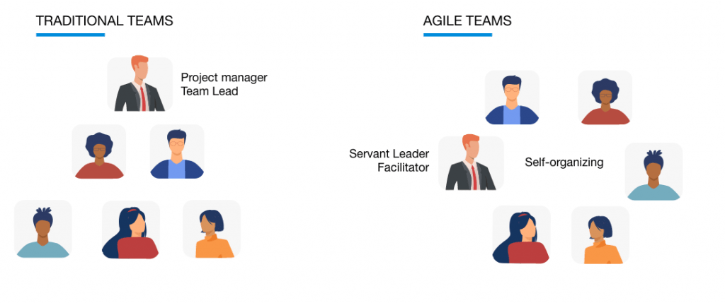
Scrum master vs Project manager. Color image showing the main differences between traditional and agile team building
The main differences in the structure of the agile and traditional teams.
The role of a project manager has fallen out of fashion somewhat, but it’s still a vital and necessary role for most teams. The project manager performs functions and responsibilities that are beyond the scope of the role of scrum master and vice versa. So let’s take a look at each of these specific roles, in turn, to get a better idea when each is needed and the individual skillset needed to excel in each role.

What Does a Scrum Master Do?

The scrum master sits between the development team and the customer’s requirements, supporting the product owner, and coaching the team.

Rather than acting as manager, the scrum master’s role is more facilitator. They act as “supports”, guides, observers, and protector and nurturer of ideas and processes within the scrum.

The scrum master is a servant leader for the scrum team, meaning that they focus on the needs of the team so they can serve the customer better.

The scrum master is not involved in decision-making, and so their role is narrower than that of the project manager. The scrum master is responsible for:

  • Making sure all members of the project team understand the scope and goals of the project.
  • Helping them to organize themselves and work together to get their jobs done as efficiently as possible
  • Helping to remove obstacles that are slowing the team down, such as slow or unnecessary approval or processes and outdated hardware.
  • Handling development tasks as requirements change.
  • Relaying information about development status and progress to the project stakeholders.
  • Supporting and guiding the product owner (who may also be the project manager) and working together to design product backlog items for the next sprint.
  • Facilitating the daily scrum meeting.
  • Promoting and supporting the scrum framework as defined in the scrum guide and helping everyone to understand and follow scrum implementation, theory, practices, rules, and values.
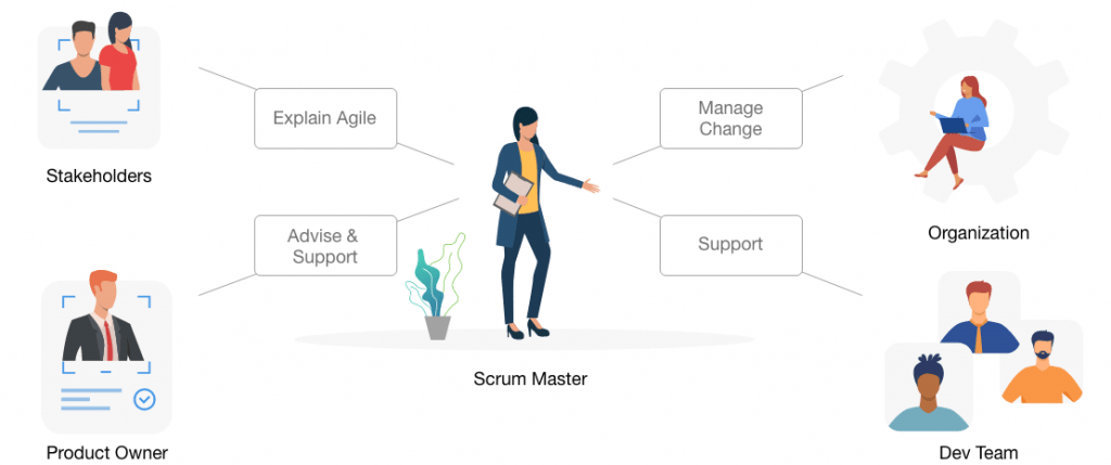
Colorful picture shows the four main responsibilities of a Scrum Master
Responsibilities of the Scrum Master.
A scrum master doesn’t plan, doesn’t manage, and ultimately isn’t responsible for the project’s success or failure. Their priority is to help the development team focused on their main priority: creating the best product they can.

What Does a Project Manager Do?

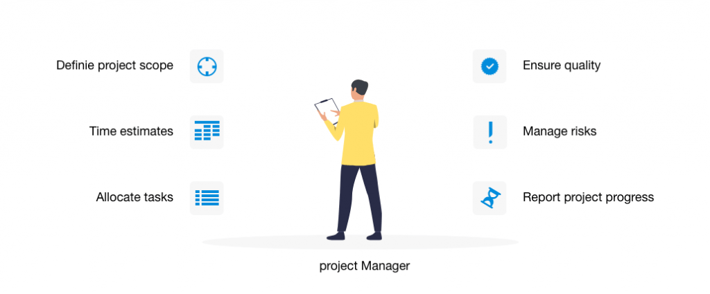
The project manager’s role, on the other hand, is to communicate directly with the customers, allocate tasks to the development team, and make decisions that affect the project.

Some of the key responsibilities of the project manager include:

  • Understanding the project scope and creating the project plan.
  • To manage the work, budget, resources, and project timeline.
  • Allocating tasks to team members and ensuring they get done in the allotted time.
  • Reporting to stakeholders and leadership on the state and progress of the project.
  • Communicating and coordinating with multiple development teams.
  • Managing and mitigating risks.
  • Managing the relationship between the customer and the stakeholders.
  • Ensuring the quality of the final project and that it meets the customer requirements.
Colorful picture display the main responsibilities and tasks of a Project Manager
Project Manager’s main tasks.
In many organizations, a single project manager works with several scrum teams, but each team should have its own scrum master.

Scrum Master Vs Project Manager - Which one do you need?

Project manager and scrum master are both important roles. But how do you decide which of these positions you need to hire for?

You need a scrum master if:

  • You already have a product owner in-house, and you want to break down the development into smaller tasks.
  • You are using an Agile methodology exclusively.
  • Your developers can self-organize and work without strong supervision.

You need a project manager if:

  • You want to give decision-making authority to a designated person.
  • You are using a mixed methodology or using Agile practices in waterfall projects.
  • You need someone who can maintain your backlog, task list, and administration.

    In summary, the two roles have fundamentally different focuses and viewpoints. To attempt to cross or merge the roles would produce a conflict of interest.

    The project manager’s focus is on the project and making it a success, whereas the scrum master’s priority is the team and ensuring their success.

    Ultimately, the project manager answers to the customer and must prioritize their needs along with the interests of the development company or organization as a whole.

    The scrum master, on the other hand, is responsible for encouraging, supporting, and enabling the team to produce the best product they can, shielding them from disturbances and threats. This includes any disturbances from the customer or other project stakeholders.

    Our approach:

    Regardless if it is a Scrum Master or a Project Manager who guides you through the project, here at Attrecto we always provide the most relevant support to our clients. Throughout the last decade we always kept up with the market changes and adopted the latest (proven) trends to best meet the business needs and requirements of our clients. That is why besides a waterfall approach, where the team is led by a PM, we also provide agile methodology (already since 2012), with seasoned Scrum Masters.

As at the “first step” at the very beginning of each project, we have a consultation phase, when we perform deep client interviews, with the purpose of finding out the most about the client’s business needs , the project’s complexity and the underlying tech-stack (if already available).

After we get a more comprehensive and accurate assessment, we can decide which approach best fits for the client and the project.

Generally, we go on with an Agile methodology when the requirements are not “set in stone” by the customer. In this methodology, clients may even ask for changes in the requirements during the development process. With this strategy and the comfort of the Scrum Master’s (SM) experience, we can:
– break down the processes into smaller parts
– respond promptly to the needs of any changes
– and provide faster review cycles, so the client is always up-to-date in terms of the status of the development.

With the guidance of the SM, the developer team can focus on its primary goal, which is to create an outstanding product.

The classic Waterfall methodology comes into play at Attrecto when customers have their exact specifications ready (and have no intention to change them later). After we agree on the terms of the engagement, the project kickoff is already set up by the designated PM, who also remains the point of contact to the product owner of the client. In this case it is our PM who makes sure the delivery team works well together and there is no communication barrier between us and the client.

Summing, when you have clearly defined roles and assign them appropriately, every individual in the organization can work efficiently and achieve their highest potential, depending on their individual skills. This results in a more productive team, better communication at all levels, and ultimately a better product – and a happy client.

Download your free guide for development process in UX driven projects

Share this post

Personalization and Targeted Marketing Through AI-Driven UX

p-img2
Picture of Attrecto team

Attrecto team

Personalization and Targeted Marketing Through AI-Driven UX

Imagine a world where you can anticipate every one of your customers’ intentions the moment they interact with your business. Now, imagine being able to tailor every interaction to each customer’s preferences, personalizing the user experience down to the last details, from colors and themes, through to product placement, recommendations, and serving the most suitable content and features. Think about just how easy it would be to steer the actions of the customers in your favor using marketing strategies based on a personalized UX model.

The prospect is tantalizing and seemingly magical. But these are just some of the things that AI-powered UX is capable of realizing.

AI is one of the fastest-growing tech innovations in the modern digital landscape. Its global market size is expected to reach just over $35 billion by 2025, at a staggering 57.2% CAGR. The fact is, more and more organizations now appreciate the value of AI-driven UX and are integrating AI-powered tools to their UI/UX design and marketing strategies.

Download your free guide for development process in UX driven projects 
 

AI-Driven UX Goes Beyond Automation

AI plays a significant role in automating business processes and workflow operations. However, there is much more to that story when it comes to an AI-powered user experience.

One of the conventional approaches to testing usability and user satisfaction on E-commerce platforms has always been A/B testing. A/B tests or split tests involve creating two or more versions of the same web page and showing each version to different groups of visitors. The versions are then critically analyzed and compared to find which design model gives the optimal results.

The problem with such an approach is that it gives you a very static user experience model. In other words, you are only meeting the majority of customers’ demands without considering individual preferences and anticipating behavioral changes. There is nothing to reflect that each customer and visit is unique.

Automated UX solves these problems by creating a dynamic user experience that actively adjusts to the needs of each customer. The AI-driven design of ntelligent UX “knows” what products and services to recommend, which content to show, which emails to send, and even the greeting message to show each visitor or customer. Personalization is a critical factor in the success of modern marketing techniques; in fact, 90% of leading marketers agree that personalization contributes profoundly to profitability.

Automated Analytics Through Intelligent UX

Besides personalization, intelligent UX also provides the business with powerful insights into the market dynamics and the brand’s performance. You’re probably already familiar with the concept of Big Data and robust analytics systems. These systems entail collecting and thoroughly analyzing vast volumes of data to draw meaningful conclusions from data patterns.

Data collected from customer interactions can be integrated into automated KPIs – for example, an experienced user who is more familiar with the application might use a complex user interface. In contrast, a less-experienced user will require a simple and intuitive interface to allow him to learn how to use the application without frustration.

Intelligent UX provides a greater scope of data from a multitude of unique customer engagement scenarios. Marketing automation involves three crucial strategies – generating qualified leads, converting those leads, and extending the lifetime value of the customers. There are four significant indicators to consider when automating your marketing process:

  •  Acquisition indicators
  •  Engagement indicators
  •  Conversion indicators
  •  Retention indicators

Automated KPIs rate leads generation, their conversion rates, and the value of qualified leads through intelligent scoring metrics. The most attractive benefit of using AI-powered marketing tools is making predictive analysis. You can leverage the power of AI-driven UX and data analytics to adjusts your business model and marketing efforts based on precise predictions of consumer behavior and market trends. A case in point is a chatbox experience, where the use of AI-driven UX would allow us to anticipate erroneous or unwarranted responses to ensure a smoother user experience.

Anticipating customer frustration or pain points can be the difference between retaining a customer and losing one completely. You can harness AI to identify when certain user behaviors would indicate that a customer is about to drop off, and surface proactive messaging that can cue the user with customer service support.

AI analytics may soon replace the conventional KPI dashboards. Smart analytics provide the businesses with so much more besides basic information. It’s about creating insights that companies can act on in real-time. AI companies such as AmpleroGumgum, and many others are already offering marketers with state of the art AI-powered marketing insights and metrics. Such companies provide advertisers with more effective ways of reaching their target audiences and judging their marketing performance through intelligent personalization.

What The Future Holds

Just about every software developer, especially in the E-commerce field, is keen on implementing AI features to improve product usability and UX. And this is not restricted to webpages either, as AI-driven UX is also growing popular in mobile development, particularly in mobile services and apps. Considering that more than half of all internet users access the web via smartphones, focusing on mobile users makes a lot of sense.

Combined with other similar technologies like augmented reality, machine learning, and deep learning, AI algorithms are growing more sophisticated and powerful, leading to faster, more accurate, and more useful, AI-based tools. Web pages, apps, and digital enterprise resources can now identify and support human needs (at least to some degree), which is the core purpose of AI-driven UX.

It’s safe to say that you should expect a lot more from AI-powered UX in the coming years. Intelligent UX will continue to reduce the cognitive load on consumers and ease E-commerce marking efforts.

Download your free guide for development process in UX driven projects

Share this post

Business Requirements in Software Development

Picture of Attrecto team

Attrecto team

Business Requirements in Software Development

When a client contacts a developer about a software development project, they either have a very clear idea of exactly what they want or just a vague idea of what they want to achieve.

Either way, it’s vital to define the scope of the project before starting work so both parties understand the deliverables and timescales at each stage of the project.

At Attrecto, we’ve developed a short template for clients to fill out when they first contact us about a project. This helps to guide the client through the decision-making process and answers some important business-related questions before we even start thinking about software solutions.

Download your free guide for development process in UX driven projects 
 

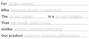
Creating a Value Statement

Many clients aren’t concerned with the specific features and functionality of software at this stage. It’s more important for them to nail down the business requirements that should be based on their vision or goals for the project.

source: scrum.org

One value statement may not cover the needs to be addressed and the business solution for every customer the client wants to serve. If this is the case, they should develop a value statement to target each group of customers. The final set of value statements will describe the functionality and business solution that are required to meet the needs of all users.


Developing the Value Statement into a Business Outcome Hypothesis

The value statement should capture the major goals and functional requirements of the project, but we then go into more detail by using it to create a business outcome hypothesis. This hypothesis has several important functions:

  • It states the quantitative and qualitative benefits that the business can expect if the hypothesis is proven to be correct. These benefits may be in terms of users affected, the expected impact on processes, products, services and costs, sales, revenues, etc.
  • It defines leading indicators that can be used to help predict the eventual business outcomes. Some examples of leading indicators include the number of users, subscriptions, costs per user, etc.
  • It determines nonfunctional requirements, which are features of the software solution not related to its functionality, such as which architecture and infrastructure it uses, how the software is built and updated, network usage and bandwidth, performance, availability, security, backup, stability, capacity, regulatory details, usability, interoperability, costs, configuration, documentation etc.

If you’re new to the idea of using hypotheses in software development, the concept is not so different from the hypotheses you were probably asked to develop as part of high school science class. You’d then carry out an experiment to test this hypothesis.

You can think of a hypothesis as a “prediction” or “best guess” of what the project will achieve.

An example of a basic hypothesis for software development might be something like: “We believe we can reduce our support requests by implementing a chatbot that will instantly answer frequently asked questions. We’ll know this is true when the number of support requests is reduced by X amount.

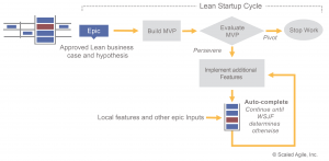
We then test this hypothesis in the leanest and quickest way possible to find out early in the development process if the solution currently in development is fit for purpose.

source: scaledagileframework.com

By using this method to define the scope of the project, we avoid adding unnecessary features or focusing on the features themselves rather than the business outcomes.

Other Information Needed Before Development Starts

Developing a business outcome hypothesis is a key concept in agile software development, and it helps us to make sure we’ve defined the full scope of the project before any work starts.

In addition to this formal process, we also capture and discuss other business-related information with the client that may be necessary or helpful for planning development. This may include:

  • A detailed description of business process steps
  • Definition of user stories and use cases in general
  • User personas (with roles in the system)
  • Minimal viable product features (the must-have features of the final solution)
  • Additional potential features (the nice-to-have features of the final solution)
  • Major milestones and deadlines.

By establishing the groundwork and expected business outcomes of your software development project in the beginning, you won’t just have a more seamless experience. This is how you’ll get the results you want to see. 

Download your free guide for development process in UX driven projects
Share this post

Why creating valid user personas is Vital in Software Development

Picture of Attrecto team

Attrecto team

Why creating valid user personas is Vital in Software Development

You’ve probably had some experience of user-testing or launching software that’s failed spectacularly. What may seem like an intuitive UX and useful functionality to you could fall apart in seconds when an actual user sees and uses your software for the first time.

But how can you anticipate how your users will think about and use your software before you reach the prototyping and testing phase?

User personas are the answer. By keeping the focus on the user experience during the design process, you ensure that every member of the development team is on the same page and working towards the same goals.

Download your free guide for development process in UX driven projects 
 

What is a User Persona?

User personas are an integral part of agile development and user-centered design. They enable the development team to think about the needs of the actual end users of their product rather than focusing on a set of features without considering if they’re actually wanted and needed.

Creating user personas for your app development company puts a human face on your users, making it easier to create software that suits their needs. Rather than trying to think about how to design for your users as a generic group, you can think about how you can make your app easier for “Bob” to use, or what features will be useful for “Sarah”.

source: Dribble.com


How Creating User Stories Helps the Software Design Process

Your user stories build on your user personas to describe what each user wants from the product so it fulfills their needs.

These user requirements become a list of features that form the basics of your app design and development. Each user story is a short sentence focusing on one aspect of functionality and usually has a “who + what + why” structure. For example: “Anna wants to organize her time so she can be more productive”.

source: Knowledge TRAIN


How to Create User Personas and Stories

As a mobile- and web app development company, we just cannot emphasize this enough: Start by researching your market – the end users who will actually be using your software or app. If there’s an app with similar functionality already out there, look at who is using it and what they’re saying in feedback on app stores.

If you’re developing something completely new, interviews with real people are the best way to gather this kind of intelligence. Concentrate on their needs and challenges rather than your proposed solution. If you work for a web development company, information from analytics and social media is useful too.

This research will give you a good basis for creating user personas based on real people. Some information you might want to include in your personas include:

      • Name

      • Background (career, educational experience, interests etc.)

      • Job title and responsibilities

      • Knowledge level (about the concept of the app)

      • Context (what are they using the app for?)

      • Environment (where are they using it? E.g. at work or at home)

      • Pain points and challenges

      • Goals and Motivations (what do they want to achieve by using the app?)

Based on our decade of experience with mobile apps, three to five personas are sufficient for most apps and software projects. Once your team is familiar with the personas, you can create user stories based on your earlier research.


The Risks of Not Using Personas

Skipping the important step of creating user personas and stories is a huge risk. Without a clear picture in your mind of who you’re designing and developing for, there is a significant chance you’ll end up creating something that’s not suitable for your users.

Even worse, you could create an app that might work well for you but doesn’t really meet the needs of anyone else.

Using personas and user stories helps to position your product better in the marketplace and ensures you’re creating software that your audience wants and needs.

Download your free guide for development process in UX driven projects
Share this post

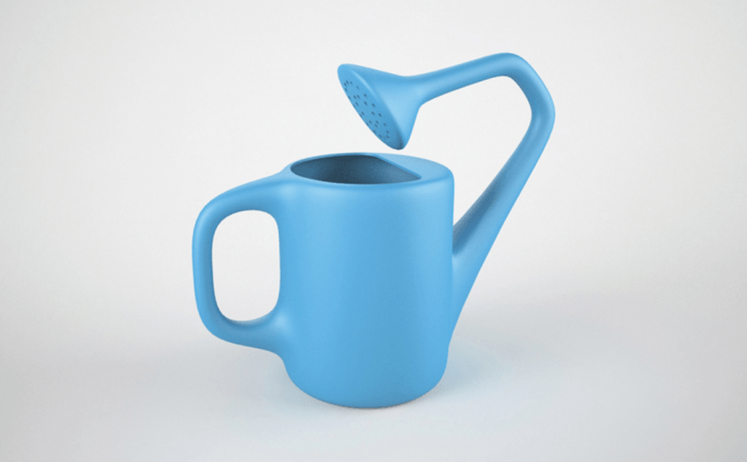
Biggest UX flops in tech

15-useless-product-designs11
Picture of Attrecto team

Attrecto team

Biggest UX flops in tech

The Biggest UX Fails in Tech History 

Even great teams fail. 

Even strong brands miss the mark. 

When a UX design goes wrong, everyone loses: the brand, the business, your reputation, your revenues, and, most of all, your users. 

You know, the people keeping the lights on?

In 2018, Icons8 lost 47% of their users thanks to a badly informed UI/UX design.

Walmart lost $1.85 million because of a failure to examine user experience surveys. This data is central to validating the central hypothesis of a UX design. 

And it’s not confined to companies — in 2011, the UK government was forced to scrap a £12 billion project for a patient records management system because of repeated issues. The web development company and teams consistently failed to meet targets on usage, functionality, and benefits. 

The Health Secretary Andrew Lansley had this to say about the failure: 

“The program let down the National Health Service (NHS) and wasted taxpayers’ money by imposing a top-down IT system on the local NHS, which didn’t fit their needs.”

UX fails come in all shapes and sizes because UX is not just about how it looks. UX is just as much about how it works. And it’s about the actual process behind the design. 

As you’ll see from these major fails (and one truly frustrating flaw that we still encounter today), it’s not just that the timing wasn’t right — the entire process matters, from the details of when to launch and how to meet customer expectations, to whether users have actually tested the prototype.team.

Download your free guide for development process in UX driven projects 

Google Wave (2009)

In 2009, Google was hot on the need for a new kind of project management with collaboration at its heart. 

But the design was not so hot.

Let’s say that this was the first wave of its attempt to improve collaboration across teams. The result not only bombed, it totally languished. 

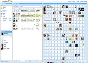
This is what the first iteration looked like. 

Never mind the dated design; the problem was that Google failed to “Keep It Simple Stupid.” The platform was much too busy and felt complex — too complex for an individual to even want to try and navigate. 

This unnecessary complexity popped up again in the fact that Google was focusing on too many projects at once. It decided to launch Google Buzz before Google Wave was fully integrated. 

Coupled with its limited user adoption strategy, the project gained zero traction and was an unmitigated disaster. 

Live and learn, right?

Windows 8 (2012)

Three years later, the Windows 8 debacle proved to mobile development companies the power and importance of continuity and consistency. 

One of the prime principles of UI/UX design is to keep a user’s expectations alive. What a user expects, a user should receive — not least because, through your previous iterations, you’ve likely spent time and money educating your users about how your interface works. 

When Microsoft first released Windows 8, it was a clear shot at Apple who was quickly eating up market share. 

First big mistake: Trying to ape another platform’s functionality. 

From here, things got worse. Because Microsoft abandoned their initial interfaces entirely, users were completely unable to find the most basic functions. 

Navigation was a nightmare and these major changes came at the expense of their users’ expectations. 

Anyone using a Windows PC knows that the desktop and the Start menu are the main points from which to operate tasks and access the file system. 

Instead, Windows 8 users were subjected to an OS that was trying to fulfill the duty of two: It was intended to be both click and touch-friendly

The problem was that, in trying to accomplish both, it did neither well. 

First, Windows 8 removed the Start menu and the default Desktop screen, completely pulling the rug out from under users who, over years of loyal and expected use, now had ingrained expectations. 

After the ensuing chaos and uproar, the customer experience was completely diluted. Sure, Microsoft re-introduced the Start button in version 8.1 — but not before many chose to downgrade to Windows 7.

Now, does this mean that interfaces shouldn’t evolve or that visual identity shouldn’t keep up with modern design standards? No. Certainly not. 

But that’s why changes in UI/UX design need to…

  • Be incremental
  • Keep the main functionality alive, even if the look and feel changes
  • Be based on the results of tangible user testing 

The USB

It’s not scientifically proven or anything but, about 50% of the time, USBs are inserted incorrectly. The user sighs, frustrated, then pops it in again, fingers crossed, hoping and praying to the powers that be that this time, it’ll actually stay in. 

We all know how this story ends. 

The USB is a very common tool and we still rely on USB connected devices every single day. 

To this day, we’re never quite sure whether we’ve inserted it right.

This serious design flaw has a pretty simple fix. To understand it, just look to its predecessor: the plug. Sockets and outlets have their own configurations that are visible to the user, neatly indicating how plugs should be inserted. 

Or you could completely eliminate the USB connector once and for all and opt for a design that doesn’t depend on the orientation of the plug. 

Apparently, designers for Apple and Android phones agree: the latter introduced the lightning connector, while Android phones have developed the C-type USB. 

Source: Dignited

Conclusion

UI/UX’s power is the fact that anything, given enough time and thought, is ultimately changeable. 

Sometimes, all it takes is for UX designers to put themselves in their users’ shoes and look at it from their perspective. It’s why the stages of design — such as prototyping or running sprints — is so crucial to the process of good design. 

Avoiding pitfalls is a collaborative process and it calls for iteration. This iteration shouldn’t be avoided. But there is definitely a way to do prototyping right — prototyping for pros. 

Learn more about how to rapidly prototype for software development and bring a sense of business value to your design team.

Download your free guide for development process in UX driven projects

Share this post

Three Keys to Digital Growth You Need to Know About

growth-strategy
Picture of Attrecto team

Attrecto team

Three Keys to Digital Growth You Need to Know About

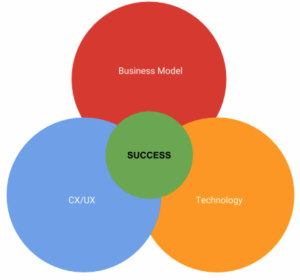
There’s a fire in the building and you can only save two out of these three things: User experience/customer experience, business model innovation, or the technology-driven product/service underlying your whole raison d’etre. 

Which do you save?

(Note: This is a trick question).

Do you…

  • Keep the “good” business model and powerful tech but throw away CX/UX?
  • Harness an effective business model and prioritize UX/CX but forego tech?
  • Juggle UX/CX in tandem with tech but let the business model go?

If you guessed Secret Option Number 4, “All three,” you’d be right. 

You might be wondering: 

How the heck are we supposed to balance all three? 

Luckily, there’s an intrinsic relationship between the right business model, the actual tech product and the UX/CX design component that encourages and supports users in their adoption. 

An alignment of all three is a continuous but seamless process — if you’re making all three an equal priority. 

Lose a grip on just one and you might experience the following: 

  • Good business model and innovative tech/app product, but bad CX/UX? That means a lower number of users with no competitive edge.
  • Good business model and effective CX/UX, with poor underlying technology? The result is low efficiency with an unsustainable operation (ex. outdated or slow-progressing, cross-platform solutions).
  • Streamlined UX/CX and powerful technology, with a misaligned business model? You’ll miss out on a tangible value prop, a tech demo without any real value or purpose for customers. This means, once the novelty has worn off and the honeymoon period is over, user acquisition will decline and the company won’t be making any money 

Business success comes from a masterfully planned business model built on and responsive to real, flesh-and-blood, felt and experienced problems of your customers. 

Yes, you want to look for these problems — and then you want to respond to these problems with your web app product or solution. Your value proposition articulates this to your customers while the technology and overall CX/UX subtly convinces and converts them as committed users. 

So how do you balance all three? It’s not exactly “simple” but it doesn’t have to be complicated either. Often, digitization is the first step to transformation. 

Let’s take a look at three specific steps that will grow these transformative activities. 

1) Start With a Solid Value Prop and Business Model

If you don’t have a value prop, you don’t have a product. But if you don’t have a value prop, you can’t make a promise to your users. 

Your app’s value prop is the first and only thing that determines when your users will even find a use for what you’re selling — or if they’ll end up hitting the BACK button. That’s the customer-facing side. For you, articulating and outlining the value prop is an ongoing endeavor because this will be the main thing you’re going to test. 

This promise is not a static, set-it-and-forget-it statement either — your value prop needs validation on the market, via customer/user interviews and surveys, as well as measuring through user tests. 

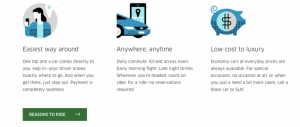
Source: Uber

Uber’s value prop is a two-fold message and functionality. It clearly conveys to the two key pockets of users — passengers and drivers — what they stand to gain and, implicitly, how they can expect the app to work, based on this promise. 

From apassenger’s point of view, Uber delivers on the following: 

  • No need to wait for a taxi for long times
  • Free rides on certain occasions and discounts from time to time
  • Prices lesser than the normal taxi fares
  • Uber’s tagline says — “Your personal driver”, promising customers that they can not only travel in style but also on their own time
  • Fixed prices for common places like the airport, etc.

From the driver point of view, they stand to gain from: 

  • An additional source of income
  • Flexible working hours: Can work part-time, according to their own schedules
  • Easy (and dependable) payment procedure
  • Those who love to drive can earn money while pursuing their hobby
  • Uber pays drivers to be online, even if they don’t get any requests (i.e. “guaranteed”/base income)

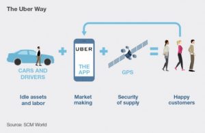
And, then, Uber app developers and designers deliver on this promise through an app that functions at scale. Being able to create profit at scale is what helps determine the cost structures, margins, and even processes that will be required moving forward. 

Source: SCM World

In the case of Uber, identifying and then clearly articulating its two main user/customer bases and their promise to each through one app helps them make decisions on:

  • Key resources or assets that will be required to deliver on this value prop (people, tech, channels, etc.)
  • Key processes,which are the operational and managerial requirements needed to deliver this value in a consistent and scalable way (UX/CX, testing, development, iteration, sales, marketing, etc.)

2) Constantly Test and Refine Your CX/UX

Your value prop is connected to your business model, which, in turn, gives you partial answers for some key business decisions. 

But what about decision-making when it comes to the production and development of your app?

The second step focuses on the app’s process and will call on you to put yourself in your users’ shoes. Good thing you’ve already figured out who your main customers are, right?

To determine how easy, enjoyable and effective your built app is for your customers, you’ll need to define a clear and logical sequence of events that take your customer from “problem-aware” ( in this case, I need to find a ride and fast!”) to solution-use (“I have a ride-sharing app that I can access to cure this need!”)

UX/CX is not just a novelty or all about fancy screen transitions. 

It’s a measurement of how useful or effective your app or solution truly is in guiding the user toward their end goal. The question is if they’ll arrive at that goal easily or if the journey will be confusing, infuriating, counter-intuitive, clunky, or just plain frustrating?

The good news, as you can see, is that while there are many ways to go wrong, there is only one way to make it right. And that’s to constantly test and refine your app’s features, processes, and offerings, based on real users interacting with and using the app. 

Once you’ve gathered actionable data from user tests, customer surveys and interviews, you’ll need to translate this data into design and development imperatives ready to be prototyped. 

During the prototyping process, you’re going to be testing different layouts, solutions, and flows that respond to these customer use data points.   

Source: Uber Design on Medium

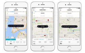
In the case of Uber, there are clearly themed screens that align with the goal for each step in the process:

  1. Requesting a cab for an address
  2. Searching and matching the passenger with a driver
  3. The arrival of the driver and the distance from the passenger
  4. Ride in progress…
  5. Payment & rating at the end of the ride

Source: Uber Design on Medium

All of these are combined with a fleshed out, well-refined UI/UX, which eliminates a lot of friction points in user acquisition and retention. 

3) Build a Powerful Base Product Using Innovative Tech as Both a Resource and a Driver

Okay, so you’ve got your profit formula, which is your value prop and aligned business model. 

Then, as a second step, you have the key processes, which are your customer and user experience design, iterations, and tests. 

Now, what about your key resource?

The underlying tech you use is the key resource or asset you’ll employ to drive digitization and successful digital growth forward. So, the technology should be both innovative and sophisticated.

Source: Uber Engineering

Uber’s engineering and development department, for example, had a very clear and succinct, actionable mission: 

“Uber’s mission is transportation as reliable as running water, everywhere, for everyone. To make that possible, we create and work with complex data. Then we bundle it up neatly as a platform that enables drivers to get business and riders to get around.” 

— Uber Tech Stack, Part One

Technology gives you an edge over the competition because it’s the tracks on which customer experience (UX/CX) runs its train. 

It’s the initially (seemingly) expensive investment that brings you long-term ROI because of how much hassle it saves and how successfully it onboards and retains your customers right from their first interaction. 

And you must deliberately craft a tech stack that responds to and serves this goal of digital growth. Uber’s engineering team certainly understands the power of this: 

Source: Uber Engineering on YouTube

As an app development company, we’ve seen that solid, native development right at the beginning is a business’s vote of confidence in its own long-term viability.

Plan to be around for decades to come? Then plan for growth. Plan for a huge amount of users. This doesn’t mean getting extremely fancy or implementing resource-sucking features your user doesn’t need. 

By all means, keep it simple. But prioritize these “simple” tasks by allowing your app’s development to perform them consistently, reliably, and excellently. 

The added bonus? When you do inevitably reach the envisioned number of users, you won’t have to rewrite the whole solution to handle a larger load. You’ll be ready for it.

“Uber’s maps teams prioritize the datasets, algorithms, and tooling around map data, display, routing, and systems for collecting and recommending addresses and locations.”

— Uber Tech Stack, Part One

Source: Uber Engineering

The Venn diagram we saw before, between internal and external impact, affects many interconnected decisions. As you can see, something such as maps, on the backend, requires the use of a powerful and aligned tech stack which is able to handle the task’s requirements. 

In this case, the Uber Engineering team chose a primarily Java-based stack. 

And don’t take for granted the fact that backend and user-facing activities need to align. What looks to developers and designers as data in the backend:

Source: Uber Engineering

…can (and should!), to users, easily translate into an experience like this:

Source: Uber Design on Medium

Conclusion

It’s time to look at growth in an entirely different way. Instead of a set of disconnected practices, the keys to digital growth are ongoing in nature. Because of increasing integration and interconnection, decisions in one aspect — the business model, for example — necessarily affect the level of technology innovations demanded or the development style used. 

The “bad” news: You can’t prioritize one over the other and expect to reach either business success or experience digital growth.

The good news: Any gains you make in one will naturally spread to and affect the others. 

Download your free guide for development process in UX driven projects
Download your free guide for development process in UX driven projects
Share this post

Prototyping for Pros — How to Rapidly Prototype for Software Development

ux-788002_960_720
Picture of Attrecto team

Attrecto team

Prototyping for Pros — How to Rapidly Prototype for Software Development

You usually don’t have to preach the perks of prototyping to designers — they’re in the know. It’s their process, their everyday expectation:

Have project, will prototype, goes their mantra.

But what about software development? 

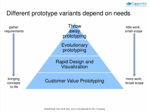
According to CapGemini, prototyping for software can bring on 4 distinct advantages for teams looking for:

  • Clarity: using “throw-away prototyping” to get requirements right
  • Iterative thinking: using “evolutionary prototyping” to think and build in an iterative and progressive manner
  • Getting the customer involved early on: using “customer value prototyping” to focus on and discover a customer’s needs or expectations of the software solution
  • Concept visualization: using “rapid design and visualization” to communicate and visualize the projects to clients/stakeholders 

Why does this matter? For an app development company looking to stay competitive, there’s a distinct advantage to adopting a user-centric point of view.

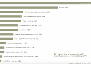
Because so many app development teams and companies already operate according to agile methodology, often working in a scrum environment, prototyping can support the need for an ongoing form of customer and user feedback in development.  

Source: The State of Software Development 2018

So what does software prototyping look like? And what does a web development company stand to gain when harnessing rapid prototyping? 

Let’s take a look.

What is a Prototype?

Prototypes are…

“an initial or preliminary version from which other forms are developed. This provides you with insight into the functionality of your design and any changes needed in order to make your work a pleasure to use.” — Daniel Bramhall, “The importance of prototyping your designs

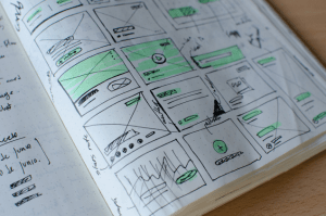
Prototypes can be as simple as sketches, drawings, and drafts, or more physical and complex like models, sculptures, and replicas. 

The idea behind a prototype is two-fold: 

  • To provide a simulation or a sample version that can also act as a convenient starting point
  • To use the incoming observed and measured data to test out the product from this sample and gain new ideas on what’s working and what needs to be improved upon

The whole point of a prototype, then, is to both plan for and precipitate change. 

Software development, as a discipline and as an activity, knows all about change. And this makes prototyping especially useful in the beginning stages of information gathering, requirements, and estimations. 

Source: Unsplash

Download your free guide for development process in UX driven projects

Prototyping is essential and inevitable

Here, we’re talking about prototyping the code that runs the show and/or the features that will be included.

Within software development, prototyping holds very concrete and distinct advantages. 

  • It can help resolve issues of usability by connecting the user to the software at an earlier stage in agile or iterative development
  • Building out a prototype before can reveal areas that need improvement or features that must be thought through more carefully
  • Real users can interact and use the final version, allowing developers to track whether there is enough simplicity and ease or if the code is too buggy, clunky or inefficient
  • In the beginning, a “rough” or “lo-fi” prototype can help elicit requirement as well as validate requirements your team might have forecasted
  • Prototyped programs can help transmit intent not just for the user but to the development and design team; moving from concept to visual model engages a different level of understanding and creativity
  • It can be seen as an essential risk reduction activity, especially in cases of the accuracy of estimations and the anticipation of the scope change requests down the road

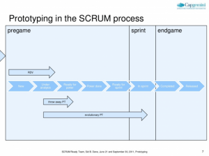
Source: “Prototyping in a scrum environment“, CapGemini, Slideshare

Keep in mind that, besides the types of prototypes you can create, based on stages of development, there are also various modes of detail. 

“Lo-fi” prototypes are much less detailed, high-level, conceptual and simplistic. As a result, these designs are:

  • not entirely definite
  • used when the focus is on scenarios of use and user flows
  • intended to clarify the thinking process without too much clutter

Compare this with “hi-fi” prototypes, which are much more detailed and closer to the end model/concept, as well as:

  • used when you need to convince stakeholders who are looking for an investment from a VC, for example
  • used when the designs are nearly done
  • chosen if you’re only iterating or adjusting for functionality/features

4 ways prototyping helps you go pro

Prototyping, especially within the context of agile methodologies, is a stage by stage process. As we saw previously with the Cone of Uncertainty, the phases of a software project’s evolution, especially in the beginning planning stages, can be shrunk significantly. In lieu of this “quick” and “lean” start, development is spread out throughout the course of its growth, from the first conception to “final” iteration. 

Prototyping is highly conducive to this “iterative” nature as prototypes can be improved upon. Some formats of prototyping, such as wireframes, as we’ll soon see, are more flexible and relevant to the process of prototyping. 

It also helps hammer out four key elements of production and development, including:

  • Interaction: How does the user interact with the software? Take note of any expectations that were not met or, better still, completely disrupted. Was there enough guidance? Were the functions too difficult to discern?
  • Identifying the kind of prototyping required: Does the project call for “throwaway prototyping” (aka “rapid prototyping”), or will it be more successful with evolutionary prototyping wherein a robust prototype is built in a very structured manner and then consistently refined from there
  • Look and feel: Depending on which technique you’re using and whether you’re casting a lo-fi or hi-fi prototype, you can gain an insight into what that user experience should look like and feel like, using code; this is usually the moment designers and developers must work together
  • Potential problem spots: After getting the user involved and observing them interacting with the software, prototyping can help highlight major issues on interaction, glitches, and unexpected bugs

Source: “Prototyping in a scrum environment“, CapGemini, Slideshare

You can clearly see, by now, that prototyping and agile methodology is a very complementary and intersectional process. It can even allow you an iteration on every possible version of your design or feature.

The whole point of prototyping is to afford you, the developer, key insights that might have stayed hidden until the “final” version, causing major failures and skyrocketing costs to try and “fix” once a project has gone live.

Source: Unsplash


Traditionally, there are various methods of prototyping, for both software and design. As we’ve seen above, some forms of prototyping are more conducive to a particular “stage” in the development process. 

But there are various tools and methods you can use to prototype for apps and software. 

So let’s focus on the trifecta of paper, digital and wireframe prototyping, taking a look at the advantages and disadvantages of all three. 

Paper Prototyping

Perfect for “rapid” or “throwaway” prototyping, paper prototypes are perfect for brainstorm sessions, working well during the early stages. Paper is easily accessible and ideas can simply be placed on a page. Paper prototypes are also quite “lo-fi” — though there is an app out there known as “POP” that turns sketches into interactive iOS and Android prototypes. 

Source: Prototyping On Paper

Simple screens are drawn on paper and configured to mimic a digital interaction, switching the sketches according to user behavior

Advantages

  • It’s fast to get ideas down
  • It’s inexpensive, which is beneficial during the initial planning stages
  • These lo-fi sketches can be used later on as the basis for documentation

Source: Unsplash

Disadvantages

  • At this stage of ideating, you could be gaining false positives, there’s a risk of confirmation bias where your ideas essentially remain untested.
  • Not realistic (yet).
  • Because your paper prototype has no connection with its users, it cannot forecast user flows, it’s not interactive and so there is no sense of anticipating reactions — how do screen transitions work? What is the functionality behind each static drawing? Reactions are missing and this is crucial, especially when approaching development from a user-centric point.

At the end of the day, paper prototyping is only useful for the early stages, when most of a project is still abstract. The further you get into the design process, the bigger the gap between paper prototypes and the final product.

Digital Prototyping

Digital prototypes are the most common form of prototyping and are realistic enough to accurately test most interface elements.

Digital prototypes can be built using apps and software made specifically for prototyping. You can even make simple digital prototypes using presentation software like Powerpoint or Keynote.

Advantages

  • Can incorporate realistic interactions and animated transitions
  • Are extremely flexible: it’s easy to edit, enlarge, refine and share
  • Speed: Paper prototypes have the edge on getting the idea down but digital prototypes with a computerized interface can do more, faster — they can be transferred, marked up and widely shared and distributed

And while speed varies from app to app, most have user-friendly interfaces and features like interactive elements or drag-and-drop.

Source: Unsplash

Disadvantages

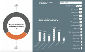
  • There is a learning curve: Before you can build your prototype, you’ll need to learn the software. According to the survey results showcased below in the State of Software Development graph, 17.58% of developers say the most limiting factors of new tools are the amount of time it takes to learn it.
  • Transitioning to code: Depending on the software, translating your designs into code can be a hit or miss and incompatible elements might get lost in the transition. At some point, you’ll have to address these and code these from scratch.

Source: The State of Software Development 2018

Wireframes for prototypes

Wireframing software is a kind of digital software or app also made specifically to outline the elements of a new development project. It can be as “hi-fi” or “lo-fi” as you’d like. However, wireframing gives designers and developers the greatest amount of flexibility. 

Using wireframing, you can employ evolutionary prototyping, which is all about building a solid blueprint up front and then constantly refining as the project brings in more user data. 

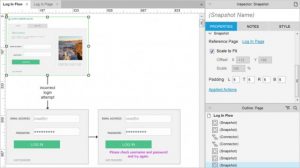
Wireframes are a graphic structure of a website or app. However, they also include details on transitions, buttons, animation, user flows, features, screens and more. Wireframes can incorporate multiple situations of usage and so they’re perfect for A/B testing. 

It’s a graphic structure of a website or app containing the content and elements.

Source: Axure

As a kind of layout design and a master blueprint, rather like the plans for a house or a building, wireframes have three broad levels:

  • Contains the main information
  • Draws the outline of structure and layout
  • Incorporates the visuals and descriptions of the user interface

Source: Axure

Experiment now or forever hold your peace — that’s what prototyping is supposed to be all about. Prototyping gives both designers and developers the license to ideate, create, test and refine. 

Lather, rinse, repeat because this is when things are allowed to “go wrong”.

Download your free guide for development process in UX driven projects
Share this post

Business Value of Design

wallpaper
Picture of Attrecto team

Attrecto team

Business Value of Design

Boosting Your Business Value With the Power of Seamless Design

Companies with a greater emphasis on design seem to win out in every sphere. From revenue to customer satisfaction, greater levels of growth and more predictable long-term sustainability, the power of seamless design is doing more to boost business value right now than any other singular investment. 

It may have something to do with the fact that better design starts with a customer-centric approach and culture. An alignment, in other words, with internal and external priorities. And while numbers don’t necessarily give the whole picture, like scaffolding, they help support decision-makers as they take a closer view into the details of the structure. 

Certainly, that’s what McKinsey’s groundbreaking study on design for better business value shows both shareholders and company executives, allowing us to examine:

  • Why companies with design-led experiences are on the up-and-up in every way
  • What the elements are that are absolutely integral to bringing business value
  • The specific, actionable principles each company can incorporate to experience the promised land of growth-revenue-brand-longevity through something like design that, when it’s working well, is supposed to quietly move into the background 

Let’s take a look.


Convergence is Upon Us


Two minutes into a conversation at a networking event, a UX designer who’s asked what his work actually consists of struggles to come up with just one neat little phrase that might cover the breadth of value that design brings to the company’s business. 

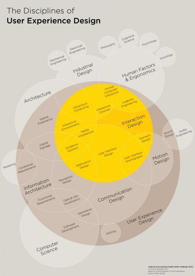
If he were doing an AMA session at a conference, he might stay silent and simply pull up this oversized Venn diagram to try and succinctly respond to the question:

Design Disciplines creating business value

Source: Visual.ly

Research by McKinsey reveals a very clear reasoning for incorporating, enhancing and focusing on the way in which design is actually the purveyor of professionalism, productivity, and profits. 

Of 100,000 design actions surveyed from the design practices of 300 publicly listed companies within a five-year period, Mckinsey found that good design equals “superior business performance.”

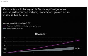
Known as the “McKinsey Design Index,” top performers were those that showed the greatest improved financial performance, in accordance with four broad design principles. Companies with top-quartile MDI scores outperformed the standard industry benchmark “by as much as two to one.” 

Design focused companies generating more revenue

Source: McKinsey Design Index  

To understand why design is so integral, let’s go back to that Venn diagram. The most obvious takeaway is that the lines are blurred between disciplines, and each intersects and converges — to a greater degree than ever before. 

The reason that companies with specific design practices perform significantly better than their competitors is because:

  • Excellent user interfaces and customer experiences are a standard expectation (with tangible benefits like increased user retention, more targeted marketing budgets, greater levels of profitability due to customer satisfaction and brand loyalty, etc.)
  • There is a major level of convergence going on, not only in the operational “backend” of companies but in the physical and digital worlds (think omnichannel shopping experiences and QR codes), along with a blurring of lines between products and services (think Microsoft’s branch into cloud services, under Satya Nadella, responsible for the greatest profits in Q4 of 2017)


Elements of the Design Process Integral to Outstanding Business Results


The design process, in the context of direct financial performance and revenue generation, comes down to four broad but essential components. 

  • Analytical leadership: Being able to implement the software, tools, and technology that measure the drivers of design performance with the same rigor, focus and deliberation as revenues and costs
  • Cross-functional talent: Nurturing teams of designers and developers that work together, along with the structures — like running sprints — that make user-centric design part and parcel of everyone’s focus or job, rather than being siloed to one department
  • Continuous iteration:Making the development process a risk-reduced process by continually listening, testing, and iterating with end-users
  • User experience: Bringing together the disciplines and measurements of physical, digital and service design, especially breaking down the internal or operational walls

We’ve already seen “data-driven” decisions. But what about “design-led decisions” in improving business value? 

This matters now more than ever because of the opportunity that businesses have to tackle their processes from a standpoint of cost-efficiencies, rather than cost-cutting. 

You see, large- to medium-format enterprises can learn a thing or two from the behavior of lean start-ups, which must rely on prototyping and iterative learning in order to keep their development fiscally responsible and sustainable. 

Business value focused design

Image source: Unsplash

Design-led decisions will also become increasingly important as we rely more and more on large swaths of user data and AI as sources of new insights. These advances and technologies will call on new techniques that are themselves guided by design, such as computational design and analytics. 

We’re already seeing that rapid access to a multitude of interactions with real customers means a better ability to reach out at just the right moment, or present just the right offer, and create a conversion.  Now, these interactions are fractured through multiple channels, especially over social media and “smart” mobile devices. 

These pivotal developments are ongoing. Nearly all of them call for the user remaining at the very center of all process and design considerations. But that also means they’ll need to be at the heart of business decisions because user design is driving priorities forward. 

Five Principles of Design-Led Customer Experience


How do we make elements like analytical leadership, cross-functional talent, continuous iteration and user-experience across disciplines guide customer experience? What are the actual practices that businesses looking to enhance their value will need to focus on?

1. Understand the customer’s needs and perspectives

Design is the differential that makes all the difference to the customer. Their delight at novel experiences and their satisfaction derived from an app that not only anticipates their needs but simplifies the process and delivers them the end result they’re looking for — these all translate into a heightened user experience, a preference for the product or service the company offers. 

Every software development or web app development project begins by creating a repository of a customer’s needs and perspectives that come from the goal of the app itself. What needs does the development fulfill?

A customer’s needs and perspectives are not just the starting point. In agile development and design-led customer experience, it’s the guiding principle of all future changes, versions, and patches.

Customer needs focus in business value analysis

Image source: Unsplash

2. Draw inspiration from other industries

While design-led experiences have been in play for a long while now — think, Apple’s obsession with beautiful type and font faces evolving to beautiful user interfaces — the way to stay innovative and question the norms is to draw inspiration from other industries. 

Consider, for example, the nature of “biomimicry.” It’s an approach where designers and engineers look to nature’s most fundamental mechanics — the scales on a fish for protection and light reflection, or the photosynthetic process of plants to understand and “mimic” energy conversion — in order to solve complex human problems through design.

3. Get a glimpse of what’s on the horizon

Because design-led experiences are half experimental and exploratory, half guided by actual customer need to develop a real solution, the resulting solution (in the form of a product, service or even feature) can be creative enough to actually pave the way for a new iteration on an upcoming trend. 

This is also why iterative approaches to design and development are so useful — they harness the power of a collective team, through structures like sprints, in order to find a solution but pave the way for something entirely new. 

4. Empower multidisciplinary teams

Design-led experiences call on the convergence of expertise, of more than one function to build something as robust as an app, enterprise software or an interface. 

There is also a convergence between the physical and digital worlds, as well as products, services, and environments. 

A great example of this is augmented reality, virtual reality, and artificial intelligence. The software “AdMind,” for example, uses predictive analytics and artificial intelligence to manage and deploy more strategic Adwords campaigns.

This convergence calls for an evolution in the way that teams work. Remember that, in order to use design as a boost to business value, it must not be siloed off as a singular department’s priority — instead, it must remain at the fore, with cross-functional teams making it a point of focus in their own respective disciplines. 

Designer team's role in creating business value

Photo credit: Campaign Creators

5. Use agile techniques to prototype experiences and business models

Agile development for an app development company syncs quite effortlessly with design-led customer experience. 

It’s a methodology for development projects that not only empowers teams to work together in an iterative and innovative manner, it’s also a process that puts the user right at the heart of all its actions. 

This iterative approach also offers a better way to incorporate customer feedback and research into the project. It’s never quite the “end” with Agile because development is ongoing. And at the heart of this development must be the user. 

Besides a design-led approach to customer experience, there’s one more thing that McKinsey’s top successful companies have realized: the boundaries between products, services, and environments are necessarily blurred. 

An “integrated” and cross-functional view is not only necessary in order to design valuable end-to-end experiences for customers, but it also gives businesses the competitive advantage they need. 

Convergence is, in fact, completely changing the rules of the game. The best way to keep stable business profits is to bring business value through design that focuses on what the customer needs. 


Download your free guide for development process in UX driven projects

Share this post